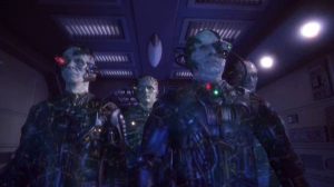
These guys are the first finished miniatures from my Adeptus Mechanicus project.
The leftmost figure is a 1992-ish Jes Goodwin servitor. Like a lot of Goodwins work this figure is pretty classic GW. The other servitor is a little more quaint in terms of sculpting and design but I like it all the same. The figure on the right is one of the earliest GW servitor models (a Bob Olley sculpt I think) from 1988 or so.
The rightmost figure is sculpted with bare legs. As it is already a bit on the goofy side as it is, I decided to paint the figure as if it were wearing spandex or similarly body hugging trousers rather than a pair of cyber-speedos. I am of the opinion that this was the correct decision: the figure could do without the indignity of wandering around in its underpants as well as all of the other appalling things that have been done to it, but of course your mileage may vary.
As briefly discussed in my intro post about the Adeptus Mechanicus project I decided to paint the servitors with a lot of visual influence from the Borg from Star Trek.
There have been various iterations of the Borg in Star Trek TV shows and movies. I watched Star Trek : First Contact while I painted these miniatures.
ST:FC probably features the definitive look for the Borg. H.R. Giger was involved in the Borg design for that movie too, which adds some sci-fi geek cred.
The definitive colours for the Borg in ST:FC are gunmetal, black, a dark rubbery brown, some grey bits, mottled grey skin (regardless of the species assimilated interestingly enough) and some lights.
The light configuration is often green for the bionic eye, a red laser pointer stuck to the side of the drones head and some blue/white lights at various points on the body. This pattern is varied, with some drones having red eyes or green body lights or whatever.

Some definition of Borg appearance based on function that I found somewhere. It is of course meaningless rubbish (medical Borg? Really?), but its the sort of rubbish that I like to look at, so you might too.
I painted the Borg servitors with gunmetal bionics, a very dark black-brown undersuit. The flesh tone has a lot of blue grey in it but it didnt come out very well in the photo unfortunately. It really is a bit of a pity as its probably the nicest part of the paint job. Hopefully later servitor photos will show the flesh areas a little better.
With all of that monochrome it was obvious that the figures needed a few bright focal points to lift them. With that in mind I decided to paint a small number of areas on each figure in a light red, green or blue, suggesting the lights on the Borg in the movies.
These are quick paint jobs (lots more of these to paint so these guys dont have to be individually stellar, they just have to look good as a group). I like the contrast in texture between the metal and the flesh. I also like that despite being fleshy the figures still retain a feeling of being cold, robotic and inorganic, a little violated even.
I was a bit wary of how the bright colour elements would work as I didnt want the figures to look like cyber-zombie Xmas trees, but the figures still needed to have a little bit of colour. I think that it worked.
Comments and criticisms welcomed, of course.
Filed under: Miniatures | Tagged: 2012, 40K, 40K Skirmish, Adeptus Mechanicus, Borg, Rogue Trader, Sci-fi, Servitor, Star Trek |


Very cool. I must say, I’m really enjoying this blog. Loads of interesting insights into the choices and designs and research you undertook. Darn, how I wish i had access to all my own paints and tools and pieces to get back into painting action figures again. It’s reading stuff like this that reenergises me.
Anyway, glad to have found my way here. It’s in my Reader now, so I expect regular updates!
LikeLike
Hi Denis, thanks for the comments. Re-energising someone is a great compliment as it is the most that I could hope for when looking at other peoples blogs.
I tend to post every Wednesday barring something major delaying things (in which case I post to let people know that I am taking some time off). Occasionally I post on other days depending on my current output.
I hope that you enjoy the upcoming stuff.
LikeLike
The red from the priests should be a welcome contrast to this.
Looking good so far mate, keep up the steam. Or should I say:
1110001010010100100000111100000110100111100101001!!!!
LikeLike
Thats the hope anyway. I cant afford to get too carried away with colour on the menial types. In my experience projects tend to get more colourful as they develop, so its best to use a very limited palette, at first at least.
Thanks for the feedback.
LikeLike
[…] home. As you can see its a pretty huge figure (from Ramshackle Games) which is why I included the Servitor for comparison. The size of the target figure isnt really releant anyway, the piece cast was a […]
LikeLike
[…] way back then, but they were pretty bad so they got the Nitromorse treatment and repainted. I saw Showboxes Servitors some time ago and I really liked the whole Borg style and was tempted to give the grey scheme a bit […]
LikeLike