

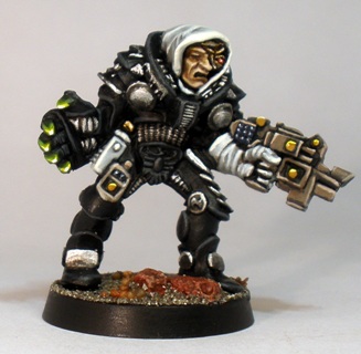
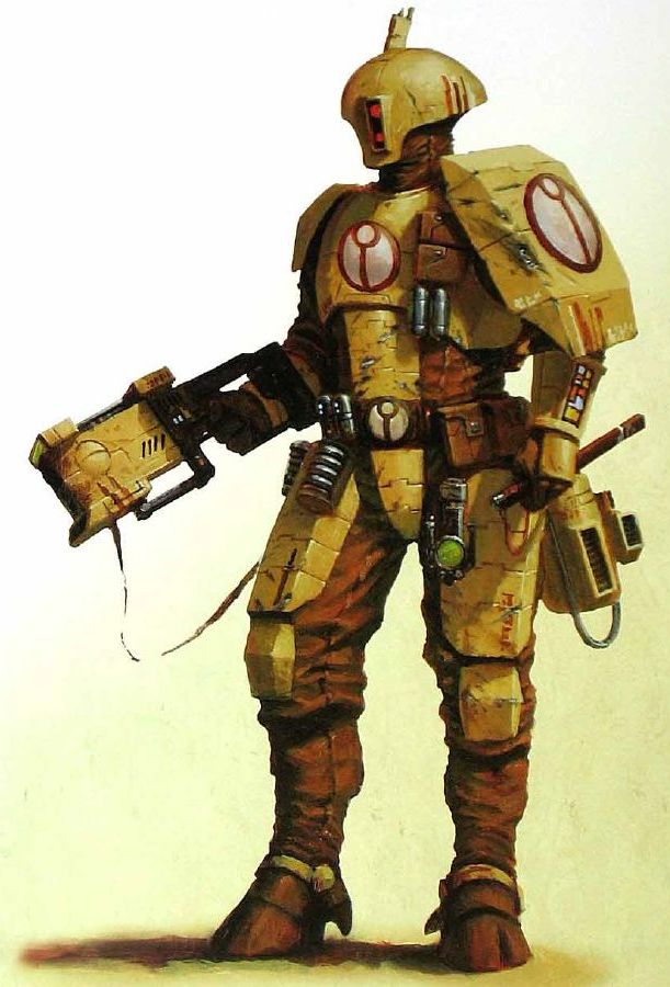
Ordo Xenos Inquisitor Verhoeven
This retro looking chap is a late eighties/early nineties GW inquisitor miniature that I picked up on Ebay a while back. I painted the figure for use in skirmish games set in the Warhammer 40,000 universe (as discussed a little here).
Verhoeven is going to represent an Ordo Xenos inquisitor in my games and a couple of elements of the colour scheme were chosen to reinforce this. I hope to surround this guy with various aliens and humans with xeno equipment as time goes on.
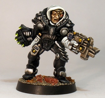
A view showing the figures bionic eye. His Magos Biologis should be shot.
The figure isnt really a classic of its era, although it does have some charm, largely fuelled by nostalgia I guess. I only ever saw the painted model feature in White Dwarf once and looking at that paint job and the slightly uninspired sculpt the lack of exposure isnt that surprising really. Its extremely rare that I can fully commit to a statement like “My paint job is better than the one in White Dwarf” but this time its true I think.
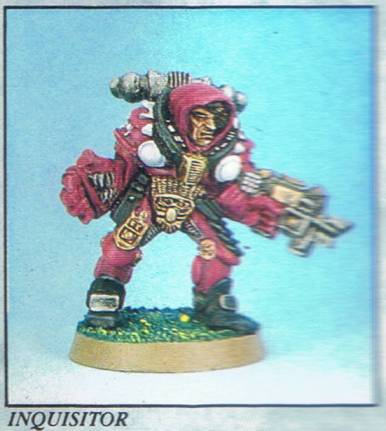
The model as seen in the ‘Eavy Metal feature in White Dwarf #117, September 1989.
I like how the model turned out, but there are a couple of design elements that I am not too keen on. Firstly, the bionic eye is a bit wonky. It looks like the worst Star Trek Borg eye prosthetics: it rests on the models face somewhere around where the cheekbone should be rather than integrating with the characters head.
I understand why this happens in cinema, but its a bit weird on a miniature. I painted the eyepiece gold as there was plenty of black, grey and silver on the model already. Despite the eye looking a bit off, I wasnt going to be able to play that part of the model down visually, so I made a focal point of the big ugly thing instead.
Not where his eye should be.
(On a side note, there is a part of me that is so far down the rabbit hole when it comes to my geek stuff that I actually enjoy that the bionic eye looks fake. Its just like the unconvincing bionic eyes in many of the cheap movies and TV shows that I enjoyed growing up. While that may not make the model more “realistic”, it does make the model more authentic in a strange way. I also like my intergalactic outposts to be distinctly reminiscent of repurposed Tupperware)
Secondly, the weapon is a bit crude looking. It doesnt look much like anything that Imperial types were wielding back then, which is fine in concept – inquisitors have access to all sorts of oddball equipment after all. The problem is that the weapon doesnt really look very cool either. It looks too much like the bits of rod and other odds and ends that it was built out of.
The most familiar Tau colour scheme.
I painted the gun and a couple of other tech bits ochre to suggest the classic ochre Tau colour scheme seen above. This inquisitor isnt afraid to fight fire with fire and engage the enemy with their own weapons. In real life it also pleasingly broadened the palette on a dark miniature.

Non STC backpack.
Mr Verhoeven was designed to have a space marine backpack attached, but I added a smaller, more high tech looking unit instead. Mainly I did this because marine backpacks are instantly recognisable and the model would lose some of its identity if I slapped such a generic piece onto the figure. Using the other backpack is also a good way to reinforce that this is a radical Ordo Xeno inquisitor who is prepared to bend a few rules regarding alien tech if it serves his purposes.
“This can happen the space cat way or the Vin Diesel way. You choose”
Filed under: Miniatures | Tagged: 2013, 40K, 40K Skirmish, Imperium, Inquisition, Ordo Xenos, Rogue Trader, Sci-fi |

Great stuff! I really like the new backpack you added, maybe I should try something similar.
LikeLike
Thanks Jonas.
The backpack worked out alright. I got a few of them for a low price from Miniature Heroes. They are Denizen parts for 25mm figs I think, but I have found lots of uses for them in my 28mm stuff.
LikeLike
Whoever voted for purple…..well, it takes all sorts I guess. The purple paint job has painted the boots like Rumplestiltskin’s shoes for godessesness sake!
LikeLike
The shoes on my version also have a little bit of that leprechaun look going on, but its less jarring when they match his outfit a bit better I think. Purple shoes on my version would have been a mistake.
As I enjoyed painting Verhoeven I am tempted to try to pick up some more of those weird old inquisitor models. I need to resist though: I have plenty of other similar stuff to keep me going.
LikeLike
Nice job, compared to the WD photo yours look a lot less busy and christmasy! Especially the weapons are a huge improvement.
LikeLike
Thanks Mattias.
Lowering the bling quotient was important. Flamboyant inquisitorial attire is fine for some sorts of character, but I wanted this guy to look a little more low key and (if this phrase is ever appropriate for Warhammer) plausible.
LikeLike
[…] after the film director as the real life Jodorowsky played the Alchemist in the movie and because my other recently painted Inquisitor is also named after a film director: it seemed […]
LikeLike
[…] dont stay tuned, go to The Governor General of Sector Six blog where you can see Inquisitor Verhoeven, Gunslinger Rosa “Digger” Stone and Pat O’Blivion – Astropath attempt to […]
LikeLike
[…] memories of working on Inquisitor Verhoeven (the “Inquisitor with Glove & Combi-Weapon” in the image above) two and a half […]
LikeLike
[…] reality TRI-D dinosaur hunting phenomenon “Chompers“, Ordo Xenos Inquisitor “Verhoeven“, gun-slinging bounty hunter “Rosa “Digger” Stone” and […]
LikeLike