Here be monsters…
For various reasons, I didn’t invest in Man O’ War when it was originally released, but the sea monster models in the range were always very appealing. Rather than looking “cool” in a modern sense, the MoW Monsters of the Sea look like 3D versions of the sea monsters that appear on old maps, which was a good design approach to take with them I think, as it’s a fun way to represent them in a miniatures game.
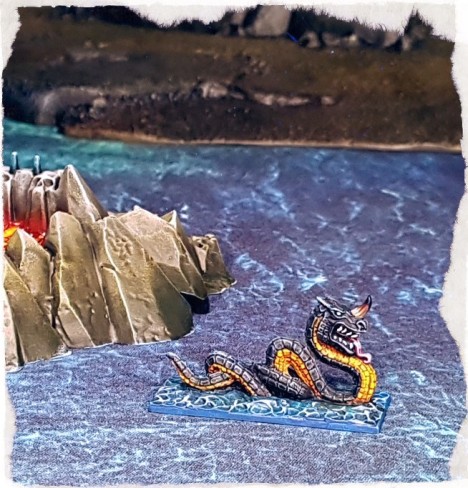
The poses on the Megaladon (shark) and the Gargantuan (serpent) look like they are skimming across the surface of the sea, rather than swimming, but I suppose that’s just one of the issues in trying to represent a model like this on a table in a recognisable way. That style also has a historical map illustration precedent.
I tend to enjoy painting 90s single piece metal Citadel sculpts more than figs from any other era generally speaking – tighter sculpting and better casting than the 80s figs, not as laborious to assemble and detail paint as later Citadel figures – but the paint schemes from the nineties don’t interest me much.
I have tended to avoid painting studio colour schemes on my models over the years too, so I did the same with these monsters as usual. Apart from that on the Promethean (crab) that is.
I had a lot of blue-greens to paint on monsters and ghosts and the like on other items in the Man O’ War/Dreadfleet project, so I didn’t want a sea green crab. A black crab would possibly have been too dull. As I hadn’t planned to paint any of the other sea monsters red, the Promethean got an approximate studio scheme.
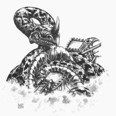
There is something pleasingly iconic about the Promethean: it smacks heavily of Harryhausen. That’s reason enough to include it in a fantasy nautical project. Like the Megaladon, it doesn’t make sense protruding out of the sea like that, but whatever.Also very much of the era, the Mark Gibbons artwork for each of the monsters is evocative and simply lovely, so I included those images here too where I could.
The Gargantuan is a pretty classic sea serpent, sculpted in a knot, presumably in the process of some sort of boa-t constriction. It appears to be quite happy with itself.The style of head and mouth on this sculpt looks quite a bit like the heads on the plesiosaur like Sea Dragon models in the range, both the wild one and the various species of Sea Dragon that the Dark Elves see fit to stick houses on. The head is quintessentially 1990s Citadel, unsurprising for a Michael Perry sculpt I suppose.
The colour scheme on the Gargantuan was initially inspired by this real life sea snake. I didn’t want to go with green and I had yet to paint any of the monsters with yellow, so this made sense.
Like the rest of the models in this part of the project, I was fairly fast and loose with the painting. It was more of a chill out process, with little planning and a lot of fudging where what seemed like good ideas turned out to be bad ones. The finished models are very far from perfect, but they are certainly good enough to play with.
The Sea Elemental was pretty straightforward to paint, as I just continued painting the water on the base up over the entire model. I added some greens to the head and hands to hopefully stop the figure from being completely camouflaged. I don’t know if it worked, but painting the damp little guy was very rapid and pleasant.
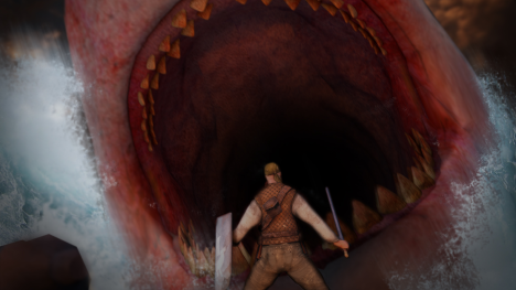
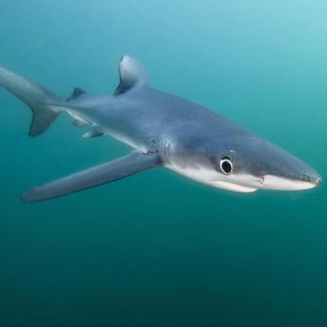
Gotta have a shark in a range/game like this, even if the squeaky toy style model design doesn’t really generate the scrotum tightening effect that this Man o’ War Corsair image does…The studio Megaladon scheme took a pretty goofy looking model and made it look worse in a flat grey, so I went for more of a blue shark look.
I probably painted too much of the model in blue, in retrospect, but it’s finished and ready to game with, so that counts for a lot. Part of the fun of painting small, single model projects like this is that there isn’t a plan or a test piece. Sometimes it works out perfectly, but usually it works out like the Megaladon: acceptable, but if I did it again then I would improve a few things.

“The term “shark-infested” waters is pejorative” said Gary the 150 metre megaladon to the terrified man in Castle Island.
As far as iconic giant sea monsters go, the giant squid beats the lot, even giant sharks.
It even gets a music video.
The Kraken model from the MoW range is very much a product of its time, quite two dimensional to aid with moulding. It was fun to paint regardless. It does look quite a bit like the Mark Gibbons artwork too.
Squid are strange looking creatures, their eyes in particular being very peculiar. Rather than get too heavily involved in trying to get a polychromatic, iridescent look to the the entire model – which may have looked nice, but also may have required that I repaint the model if I screwed it up and time is always a factor – I drew attention to the eyes with silver paint, the new Hexwraith Flame Citadel paint and a gloss varnish.
Filed under: Miniatures | Tagged: 2018, Fantasy, Man O War, Pirate, Warhammer |


That’s about the nicest treatment of those models as anybody has ever seen I expect.
LikeLiked by 2 people
Thanks otto!
The classic studio schemes are applied to a much higher technical level, but the colours used do little for me, even with my penchant for gaudy.
I dearly hope that hundred of your miniature crews souls are dragged to Davey Jones from The Monkees Locker by these terrifying behemoths in the not too distant future.
LikeLiked by 3 people
I am working up a Chaos Dwarf steamer as I type this to send them crashing to the sea floor on fire! Moo haa haa, what can possibly go wrong?
LikeLiked by 1 person
Mad science meets sea monster and demon worship… nothing to see here…
LikeLiked by 1 person
Very fun and well done. Talk about Deadliest Catch!
LikeLiked by 1 person
Hah! Thanks Mark!
LikeLiked by 1 person
very cool!
LikeLiked by 1 person
Thanks Paul. Maybe not mainstream cool but cool all the same I think.
LikeLike
Oh, but you made the most excellent work on these! :O I’m particularly fond of the crab and the shark, they both look incredibly natural. I love them!
LikeLiked by 2 people
Thanks Suber, Im glad that you like them.
The designs are pretty comical, so I’m unsure if slightly more naturalistic tones on them work or not, but the finished products are a bit of fun, and that’s the main thing.
LikeLike
These look frikkin great.
LikeLiked by 1 person
Thanks Patrick. More to come.
LikeLike
Nicely done mate! The ‘floating on top of the sea’ thing bothers me more than it should, but that doesn’t detract from your treatment of the minis in any way – it’s more to do with my pernicketiness I think…
Do you remember the old Godzilla cartoon from back in the day? Even as a kid, it annoyed the hell out of me when the big fella would ‘rise up from the depths’ (30 stories high) and suddenly be ankle deep in the middle of the frickin’ ocean… One can only conclude that sea monsters have some kind of submerged platform device for proper looming 🙂
LikeLiked by 1 person
That Godzilla cartoon irritated me greatly for that reason… although I think that I may have actually liked Godzuki at the time… ugh.
The perched-on-surface-tension elements of the sea monster range were just something that I tolerated until I realised that it was a design decision, to make them look like old map illustrations. It was a brave decision to make when designing the models and once I spotted that was the intention of the design, I appreciated them a lot more.
Cheesy poses for sure, but it turns out adding historical graphical elements to a sculpt appeals to me. Who knew?
LikeLiked by 4 people
Loving all of these. Really nice to see a complete collection of five with the bases tying them together. Crackin’ work on the kraken work.
LikeLiked by 2 people
Thanks Curis, I’m glad that you like them.
The painting standard is probably a bit lower than that on other recent figures, but I enjoyed painting these far more too. I think that I am going to dial back the fussiness a bit more and try to get a higher output.
More monsters to follow, hopefully some ships after that.
LikeLike
Painting a gaggle of sea monsters, what could be better? Eating people’s ships with them.
Love these, cracking work. I’m getting very huge potential hilarity readings off them.
LikeLiked by 2 people
Even though I forced myself to ignore MoW when it came out, these goofy things were always something that I wanted to paint. I just prefer painting oddball things like monsters, aliens and robots to most trooper types.
If we cant get a few laughs out of models like these, then we should pack the hobby in really. I mean, look at the state of them 🙂
Thanks for the feedback Mr S!
LikeLiked by 2 people
Really loving your take on Man O’War. Those sea monsters are goofy, but so fun. So let’s see. Man O’war, Epic 40K and Warmaster are all now whizzing about my head again while I try to paint Rogue Trader/ Necromunda figures.
LikeLiked by 2 people
Keeping focus in the middle of the maelstrom of potential projects is a challenge. Lash yourself to the wheel and stay the course Sean!
Rogue Trader and Necromunda projects be worthy goals!
LikeLike
I’m glad you included the Alestorm video on this, it’s perfect and they’re so much fun!
LikeLiked by 1 person
I’m a recent convert to Alestorm Allison, entirely due to this project. My wife’s eyes rolled like she be a-havin’ a stroke when she realised that her beau be a-listenin to “pirate metal”, but me timbers needed shiverin’, an’ Alestorm be providin.
LikeLike
… Dare I tell you about Gloryhammer, then? Or will she come over here and smack me?
LikeLiked by 1 person
I have only dabbled in Gloryhammer to date. I’ll see how Alestorm settles first 🙂
LikeLike
Those are great (particularly the crabby bastard), and look like great fun for the game too.
LikeLiked by 1 person
The crab tends to be popular with people. I think its his no nonsense, easily read attitude that endears him to folk.
Thanks LGP!
LikeLike
Sweet stuff Paul! Great work on those, and the write-up is much appreciated. I never realized the old map style of the monsters, but it’s obvious when pointed out, and such a cool choice.
LikeLiked by 1 person
The map illustration aspect of the sculpts only dawned on me as I worked on the models and, as you mention, it really does make them more appealing. The odd poses on the figs switch from being “daft” to “edutaining”.
Thanks for the feedback!
LikeLiked by 1 person
[…] Man O’ War: Monsters of the Sea […]
LikeLike
[…] Man O’ War: Monsters of the Sea […]
LikeLike
Hey man! Excellent work on all of your Man o War! Inspiring stuff!
Question: what did you make the bases for the ships/critters out of? I know the waves are putty, I mean the actual bases.
LikeLiked by 1 person
Hi Jarek.
I used bases from Renedra.co.uk
It was an easier and more accurate solution than cutting up sheets of styrene would have been.
Hope that helps!
LikeLike