


More sci-fi civilians, this time grimdark representatives of a dogmatic, galaxy spanning bureaucracy. One of them has a finger like a vegetable and another is a walking dot matrix printer gimp.

My Sci-Fi Non-Combatants project has been growing in a pleasing fashion for the last six months or so, primarily via the Construction Crew and the Protesters. The project has leaned a little towards a pulpy, bright Mega City One sort of look. Thats perfectly fine for my purposes, desirable in fact, but all the same I felt an urge to add some civilians more obviously connected with the 41st millenium.

Description of the Adeptus Administratum as per Warhammer 40,000: Rogue Trader.
Although rarely seen on the gaming table, the Adeptus Administratum is one the largest of Imperial institutions, the pen pushers that keep the Imperium staggering forward (or staggering backward less slowly maybe).
In a galaxy that regards a right hand that doesnt know what the left hand is doing as virtuous, these guys are petty, blinkered bureaucrats on a par with the Vogons.

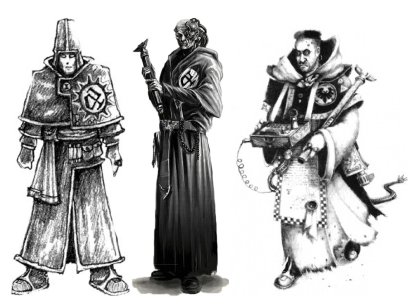
The really rather epic Warhammer 40,000: Rogue Trader Adventurers range. Distilled retro toy soldier chic.
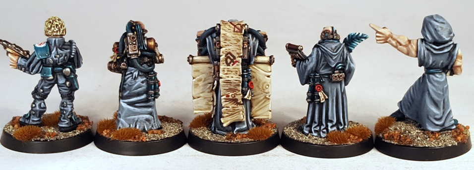
There havent been many Administratum miniatures made throughout the years. Other than some of the scribe/sage figures from the early 2000s Witch Hunter and Daemon Hunter ranges, arguably the only one was the “Official” in the Adventurers range (top row, number three in the image above).

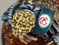
I tracked that model down recently and was very happy to add him to this project. I added the Administratum symbol as seen in Rogue Trader to the shoulder pad (it looks a little less dodgy actual size).
 I figure that the Official is some sort of Ordinate: a middle management sort that I imagine is a little higher up the bureaucratic hierarchy than the robed, more monk like Administratum types.

A typical member of the Administratum as depicted in Rogue Trader.
The illustration above defines the look of the Administratum as far as I am concerned. For years I was disappointed that a character type that prevalent in the background stories in the 40k setting was not represented in miniature.
It was therefore bittersweet to find out on Eldritch Epistles back in 2013 that a model associated with that illustration had in fact been made and even cast back in the eighties (Hooray!) but that I would likely never get one as it was unreleased (Boo!).

And then Foundry made a set of those models – the Empirical Absolution and Liquidation Squad – available at BOYL 2015 and subsequently also available on the Foundry website (Hooray again!).

Even Administratum Scribes Get The Blues
Like many of the miniatures from that era, the sculpting style is a little more quaint than generally seen these days, so perfectly suited to my aging hipster toy soldier tastes. The newly christened “Lord Revelation” here has an immense left arm and a finger like a zuccini. While that might make him popular with Lady Revelation, it is a little goofy.

Note however that on some level the Lords asymmetry appeals to my retro-chic/nostalgic old bastard tastes. Cognitive dissonance FTW!


The remaining three Administratum figures are from the early 2000s Daemon Hunter/Witch Hunter Citadel ranges. Like the Adventurers range shown earlier, the the Daemon/Witch Hunter range is a contender for my very favourite miniature range ever, but for strangely opposite reasons to the Adventurers.
The Rogue Trader Adventurers represent a gigantic, loosely defined universe, where each one of the models suggests its own history and stories. I like that, it appeals a lot to the part of me that enjoyed playing with Star Wars figures and Lego when I was a kid. The looseness is a boon.


The Witch/Daemon Hunters ranges illustrate a more strictly defined Imperium, where each element of their uniforms and accoutrements has been considered and refined over years so that they fit perfectly into the modern 40k setting. While in some ways limiting some of the expression as a result, this defined approach also appeals to me, in the same way that a genre defining film like Bladerunner or Mad Max: Fury Road can drop you into a believable world with minimal exposition. Thats these guys, telling the viewer ample about the setting at a glance.
Look at this guy. He tells the viewer a whole lot very quickly.


Thats the end of these for now. I have come up with ideas for a few more models to add here though, so I might get back to them.

Filed under: Miniatures | Tagged: 2015, 40K, 40K Skirmish, Administratum, Imperium, Sci-fi, Sci-Fi Non-Combatants |

These guys look great! It’s always cool to see some more non-combatants to add that extra level of depth to the collection, and to put to work in scenarios. I’ll definitely have to get that Foundry pack myself.
LikeLiked by 1 person
The Foundry pack isnt bad value. The figures are definitely of their time, but if the retro vibe appeals to you at all Azazel – and I know that it does – then you cant really go wrong.
Thanks!
LikeLike
The not-judges are pretty rough, but I really like that Administratum figure. I figure that the Judges can be painted in a MC-1 style (which I noticed that Foundry did) and all we need to do then is not look at them too hard…
LikeLiked by 1 person
The MC1 Judge uniform, while ostensibly remaining the same, has been interpreted in so many different ways by different artists that the EELS figures can easily be imagined to be some sort of specialist or street judge. I have similar plans.
LikeLike
Oh, and kudos for digging up the Administratum logo. I might have to make use of it myself. 🙂
LikeLiked by 1 person
Crucially, the “a” isnt terribly difficult to paint. If it was a complex logo then I likely would have left it in obscurity and made up something easier instead.
But y’know, while I dont feel like I should slavishly adhere to “canon”, I do enjoy referencing it as much as I can. It adds to the atmosphere and therefore the fun.
LikeLike
The way I see it, ’40k Canon’ is what you decide it is. They retcon and contradict it often enough themselves, so it’s all good. As long as you don’t allow heresy like female space marines! 😉
LikeLiked by 1 person
Sir, you are spoiling us. Those are just excellent, really lovely figures. I’ve always had a liking for the old civilians ever since reading the old Ian Watson inquisitor books. These are evocative of those baroque worlds.
Keep up the good work.
LikeLiked by 1 person
Thanks for the feedback Mr Kinch, I appreciate it!
Im a little way into the first of the Ian Watson “Inquisitor” (now renamed “Draco”) books at the moment actually, I had never read them before. Between that and listening to the Dune audiobook while I painted, I felt satisfyingly immersed in suitable influences.
Im glad that they seem to be conveying the appropriate vibe 🙂
LikeLike
It’s great to see the boys all finished, the coherency as a group in their corporate greys really gives them that ‘office’ feel – now you just need a young, attractive and bored temp to hang out with them, and possibly the 40k equivalent to Ricky Gervais. The concept of which chills me to the bone…
LikeLiked by 1 person
Administratum Prefect David Brentus is an appalling thought that I took to my bed last night Captain, many thanks.
I was be on the lookout for a suitable miniature candidate. I feel like these guys need a middle management “leader” beyond the Official.
LikeLike
Excellent, nothing adds more depth to a virtual universe than the people who populate it. I mean heroes are all good and fine but it’s the vast majorities of anonymous that give settings like Bladerunner, Dredd, Brazil or whatever their special taste, that’s what 40k lacked after RT and that’s exactly what you’re brining back.
Excellent I tell you.
LikeLiked by 1 person
Thanks for the kind words Asslessman!
Its the old story, if everyone is special, then nobody is: representation of the civilisation beyond the combatants is what gives it atmosphere.
Cheap sci-fi tv often falls down in this regard, with the alien princess only ever being in the presence of the two same bodyguards and the recurring visier character or the same two jumpsuit clad types traipsing down the same old corridor section every episode: no sense that there is an actual population.
Like most of my miniature projects, I have no shortage of figures that I want to add to these, so more to come I hope.
LikeLike
Another fine paint job Paul & a nice choice of using Blue where as most myself included tend to go with black, as for the amount of stuff you turn out as such a high stranded well that just leaves me green.LOL
I’m also a lover of that side of 40K mate & have model 2&3 in the line above, with model 2 been in the latest PA league I’ve made up, I named him Numbers as I think of him as an accountant type & gave him the harmless ability, so no brawling or shooting for him.
Model 3 is primed & standing in line but I’m no where as productive as you mate so it could be awhile before he hits a table.
LikeLiked by 1 person
Thanks Frank!
The turquoise-blue was a deliberate attempt to brighten the figures up a little, to visually bridge the gap between the more Mega City One type civilians and the 40k ones. I try to keep my miniatures bright, even if they should technically be drab or dark. Even a dull or dingy miniature character should have visual “pop” I think.
I spotted model 2 on your blog yesterday actually and took a quick look at the Pulp Alley stat line that you had prepared for him. I plan to lift it as is when I get my copy of the model on the table, thanks.
LikeLike
Awesome work! The writing effect on the scrolls is particularly impressive.
LikeLiked by 1 person
Im glad that you like it Antipixi. There is room for improvement on it, but it gets the message across pretty well I think.
I put off painting the script until the last stage in the process, as I want looking forward to it. In the end it was really quite enjoyable.
LikeLike
Lovely again, I enjoy the choice of minis and, of course, the paintjob. You set a nice office crew there, for sure they can do more harm on their desks than many warriors on the battlefield!!
LikeLiked by 1 person
The servo-stylus is mightier than the chainsword 🙂
LikeLike
Never knew about the The Witch/Daemon Hunters ranges (they were released during my hiatus from the hobby) but are certainly on my radar now. Thanks for sharing.
Your freehand on the scrolls is sublime!
LikeLiked by 1 person
Thanks Riot, the scrolls did come out nicely.
I only picked up a limited number of figures from those Inquisition ranges when they were released and my hobby budget was directed elsewhere at the time. I have tracked down a large number of them over the last couple of years, there are many really definitive, really nice sculpts in there.
LikeLike
Awesome work, great to see civilians realised to such a good standard. Thanks for picking out the administratum logo as well! Didn’t even realise there was one! I’m looking at doing a similar project, including some Colony 87, Dr. Who and Talisman Timescape figures, so thanks for the added inspiration 😀
LikeLiked by 1 person
Thanks Alex. Including the logo adds a little to the fun and as I mentioned in an earlier comment, its pleasing to reference the background when possible: it adds a certain plausibility (that is, in context plausibility).
I have at least one of the Timescape figures plus the Colony 87 stuff to add to the Non-Combatants, but I dont think any of the ones that I currently have will fit in as Administratum. Maybe, I had better take another look.
After seeing what you did with the RT Mercs range I am looking forward to seeing you tackle some civilians.
LikeLiked by 1 person
As always your painting skills are both sickening and brilliant!
LikeLiked by 1 person
Thank you Furstenburg, I think ;D
Coming to a tabletop near you soon I hope.
LikeLike
A great little group, some nice ideas there. I love the canonical grey robes. Also, I’m very jealous of the Official figure, would love to get my hands on that one! Great work.
W
LikeLiked by 1 person
The Official was a nice model to be able to add to this group, even if the aesthetic is quite different. The figure could easily fit into a different group of models, but it was fun to include it with these guys.
There is a little blue in the robes to keep them from being too monochrome. It livened them up a little. I did get a kick out of finishing these guys, its another of those little projects that I have been promising myself for quarter of a century actually finished. Im dying to get them in a game now.
Thanks for the feedback Warburton!
LikeLiked by 1 person
Wow these are fantasic!
LikeLiked by 1 person
Thanks RoA, Im glad that you like them 🙂
LikeLiked by 1 person
These are really rather tremendous. The colour scheme is very striking. The scribe isn’t a perfect sculpt, but I have a deep and abiding love for imperfect sculpts, (I love Slaughterloo minis for example) so I dig him.
It occurs to me that a genestealer infected Administratum official is probably the most horrific thing imaginable.
LikeLiked by 1 person
I was afraid that the scheme was a bit too cautious, particularly when I was highlighting the blue-turquoise up to grey, but some glazing and the little splashes of red pulled it together well I think.
So Lord Revelation has one arm bigger than the other: the fig is a little quaint, big whoop. That sort of thing matters little to hard-bitten, men of the world like us Mr Saturday. He is going to pointing accusingly on tables with impunity for years to come.
The Administratum would seem a priority target for ‘stealer cults. Infiltrating the Departmento Munitorium would seem to be at least as important as infiltrating the PDF or similar I would think.
Thanks for the feedback!
LikeLike
I have 2 observations:
1. Add these to your Gargouille, and it’s like you’re in the “Blue Period” of your artistic journey…. 🙂
2. Like you, I find myself drawn to civilian or non-combatant miniatures more and more. For me, these miniatures inhabit and begin to solidify the world of my games. It’s like I don’t really care if they ever actually get used in a game, they play a large part in defining the circumstances, background, and context of the games. The time I spend collecting and painting them allows me to work through their histories and roles.
Do you relate to any of that?
LikeLiked by 1 person
1. Funny that, now that you mention it. I reckon that I will be adding to these for a while yet, so the blue period will last for a while yet.
2. I can relate to every bit of that.
For starters, it was looking at your games Guiscard. and the expanded, modular terrain elements and how they could be used to generate narrative that made me determined to get some of my related projects definitively off the ground this year. That of course was in addition to the apparently endless supply of viziers, functionaries, politicians and ballroom attendees that you use to illustrate your games. My as yet mostly undocumented urban sci-fi terrain project and the Non-Combatants project are direct results of that.
While I do hope to use everything that I paint in a game or ten, I have noticed that getting them painted really scratches most of the itch. Coming up with the concept, visualising the palette, combination of miniatures and possible modifications to the figures combine with the painting process to give me most of what I am looking for from the hobby.
I love the gaming side of things and I think that I need for it to be there – I dont know if I would paint miniatures as a goal in themselves if there wasnt a notion of gaming with them at the end it – but as you say, just going through the process of fleshing out the miniatures background really supplies a lot of crucial intangible qualities to the process.
This hobby/obsession really is a peculiar mix of right and left brain activities. That slightly odd combination is what has kept me at if for my entire life
Thank you for your insightful observations and inspirational gaming Guiscard!
LikeLike
Spot on Paul. Nice use of the administratum symbol. They hang perfectly as a group in spite of the decades between the sculpts.
LikeLiked by 1 person
I’m glad that they appeal Jon, I am pleased with how they turned out.
I spent this evenings hobby time prepping some more figures to add to these. Hopefully they should be finished over the next few weeks.
Thanks for the feedback!
LikeLike
Excellent paintjob. It is quite interesting that they really shine with some distance, say on the group photo. I think your painting style really gives they eye something to work with if the distance is say 10 to 20cm to the camera. The contrast you achieve really works and makes the group look just splendid.
LikeLiked by 1 person
Thank you for the considered feedback daggerandbrush.
Contrast is what I prioritise when painting. As everything that I paint is intended to be used as a gaming miniature and usually viewed from about a metre away, I feel that strong contrasts are a requirement.
Not just contrast in colours either, but big jumps from dark to light across an area regardless of colour (such as on the robes on these models for example). I think that it suits the melodramatic, larger-than-life worlds that the games portray.
I find it interesting that you reckon that the style suits the 10-20cm sort of distance as I reckon that the visible brushstrokes can look a bit too Expressionist at that distance, in that the technique becomes a little too obvious.
But thats just me being picky really. I am quite pleased with how these guys turned out in the end.
LikeLike
Great paint jobs on these guys. The more recent Inquisitor “henchmen” figures are probably my favorite GW range ever, and you have done an excellent job with them. Any tips for the “writing” effect?
LikeLiked by 1 person
The Inquisitorial Henchmen are excellent: its a memorable range.
I don’t have any real tips for the writing and other details on the parchment I’m afraid, other than obvious things like “thin the paint” and “use a small brush”.
The “text” is quite rough really, it’s just an effort to give an impression of some sort of layout and print. The handful of shapes worked well breaking up what would have been just a large series of dotted lines: I recommend something like that if you try similar.
Thanks for the feedback!
LikeLike
Thanks for the tip about the RT minis! I’m now $50 poorer and 10 RT figures richer!
LikeLiked by 1 person
🙂 Did you buy the Foundry set? They are pretty old school and quaint, but good fun I reckon. I hope that you like them Kid!
LikeLike