

Tau Fire Warrior Test Piece
I have been promising myself some brightly coloured, vaguely anime inspired tau models since 2001 when the range first came out. I have been picking up a few models here and there ever since (not forgetting a large donation from theottovonbismark last year) but this is the first tau that I have actually got around to painting.

I painted this guy from start to finish this morning, but I reckon that I could paint up a handful of tau at a time without it taking very much longer than that. As I know that I will have 20-40 of these guys to paint for a skirmish force the scheme had to be quick and easy to apply.
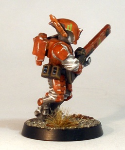
I have also wanted to paint a force that features orange for a while now, but I find orange a hard colour to paint. Then during the week I came across this post on the abrushwithbattles blog and I was inspired to try something similar with some tau. I didnt use the exact technique as described on the Chaos Knight post, but it was definitely the inspiration. Thanks abrushwithbattles!
If anyone reading has any interest in the sort of thing that I blog about here then you owe it to yourself to take a look at abrushwithbattles: its exceptional. The balance of quality versus output is phenomenal.

Although I will do a few things slightly differently once I start work on this little guys comrades, I really am quite pleased with how he turned out. Below is a shot of the Fire Warrior hanging around with some of his futuristic dark age chums.

I would love to get some feedback on this model before I leap feet first into painting up some more, so if you have an opinion, then lets hear it please!
Filed under: Miniatures | Tagged: 2013, 40K, 40K Skirmish, Sci-fi, Tau |

Thanks for the namedrop! Your Firewarrior looks fantastic, nicely applied edge highlights especially. I’m curious, which alterations did you make to my orange formula? Perhaps extra orange highlighting stages?
LikeLike
Hi laurensvannijvel.
The orange was done exactly as the way that you described for your knights in every respect. I was tempted to add some sort of vivid orange highlight, but I tend to find that colour difficult and time consuming, so I used the weathering/chipping to do the same job instead, just like on your knights.
Its the white/dirty grey that was changed a bit from your cleaner looking horses. The main difference in my approach was to use a grey undercoat and drybrush/overbrush the entire model with white first thing. After applying the the orange to the plates and the brown to the rifle butt and detail I then washed the whole model with Warpaints Strong Tone (essentially Devlan Mud). I then gave the grey/white undersuit a rough and ready pure white highlight, highlighted the brown with a Graveyard Earth/white mix and used mithril to sloppily edge the orange plates.
I am particularly pleased with this model for some reason. Thanks for the inspiration and the feedback 🙂
LikeLike
Painted up to a high enough standard for a decent tabletop force for sure. The orange armour looks good and battle tested, green markings stand out subtly. The shoulder icon is painted nicely, I remember the icon as being a pain to paint neatly.
Personally I would go for a colour in the bluish-turquoise area for either the undersuit or the gun (or both) as I think it would make the figure a little more vibrant looking. For some reason I find the grey colour a little at odds with the tau outlook, I think I may have become conditioned to associate the colour grey with 40k Imperial Oppression! I think they grey looks like it may clash a little with your favoured basing technique – or is it a good think when soldiers blend in with their surroundings, I don’t know.
I note that you have avoided the use of metallics, which makes for an interesting aspect to this project, is that your plan with it?
If you do up 30-40 of those guys to that standard they would look pretty sweet in any case.
LikeLike
A lot of good interesting points there ottovonbismark, thanks!
I inverted the colours on the shoulder icon. Black outline around a white icon is far easier to paint than the opposite is. Most people wont even notice I reckon.
Tau look good in bright colours – a grimdark antidote – and it is possible that this example isnt vivid enough. On the other hand, I also prefer if the colour scheme makes some sort of sense in the context, but not at the expense of a good looking set of figures. A balancing act.
The grey/white is quick to achieve and in combination with the not-quite-vibrant-enough-but-it-will-do orange it reminds me vaguely of Rebel Alliance pilot uniforms, which gives it a little extra appeal.
It wasnt until I based the model that I spotted that the grey does actually slightly match the basing sand and furthermore, the orange in the uniform actually makes the orange in the coarser patches of gravel pop a bit. I wasnt expecting the scheme to actually look like it might actually have a practical side – surprisingly it sort of matches the terrain – but as you say, the practicality of miniature camouflage is questionable.
I deliberately didnt want to use metallics on the Tau. I see them as using hi-tech plastics and composites rather than sheets of metal. I then flew completely in the face of that when I decide to cheat by using chips and dings instead of “proper” highlighting. In the interests of expediency, I compromised my concept 😉
Thanks for the detailed feedback, nice one 🙂
LikeLike
I for one would love a look at your Eldar in a series of features like you did for your Chaos Marines a while back.
In other news, the Tau looks very sharp. I like the bright highlighting on the clothes for some reason I can’t quite explain. Can definitely see the more grimey anime influence at work on this test Fire Warrior, and it looks nice!
LikeLike
Hi TheSnackist
I do plan to do a retrospective on my Eldar (and take some halfway decent photos of my Chaos Marines) at some point in the future, Im just not sure when though.
The somewhat crude and chalky highlight on the undersuit does work for me (its particularly nice in the shot from the rear I think). Im not sure why either. If I was feeling very art college I might say that the impressionistic style may suggest urban camouflage perhaps. But that would make me sound like some sort of pseud, so I wont say that 😉
Thanks for the feedback!
LikeLike
Nice job Paul, I think the wear and tear (and the orange itself) looks just fine. I’m also impressed by how well you’ve painted the lens!
The pants look a bit too much like city camo for my taste though. It’s one of those moments where I can’t figure out if the alien life form is wearing gray trousers with white highlights or white trousers with gray shading. Nevertheless, he looks very good as a whole and a group of 40 painted to this standard would be an impressive accomplishment. Sounds completely unreachable for me. I’ve been struggling with my Harboth’s Black Mountain Boys for a month now and they’re only 13! And I’m still not through the base coating!
LikeLike
Thanks for the honest feedback Mattias 🙂
The lens is simply black with a semicircle of a sky blue colour and a corresponding white dot and a gloss varnish (the varnish isnt really visible in the photo though). If I have lots of lenses to paint then the technique has to be quick. The lenses on the test piece above probably look better than the time spent painting them would suggest. This is a core principle of my toy soldier painting: I have too many projects to get through and getting bogged down on overwrought schemes and processes is demoralising, so quick, high contrast is key.
Your point about the grey areas is valid. I agree that the contrast is possibly a bit on the high side. Im not going to change it though, because its fast to achieve and its “good enough” (a commonly used phrase at Chateau Sho3box). Finished to “good enough” standard is always better than half finished to “perfect” standard.
“High contrast, achievable goals!” is the title of my (non-existent) miniature painting self help book 😉
LikeLike
“It’s not only good, it’s good enough” =)
Fair dos, I think the grey fabrics work well and you should indeed keep on trucking!
High contrast is something I strive for but rarely succeed in achieving. I think you often manage better than I on that account.
On a side note, many of the BB minis I got from you were primed black and then heavily (and nicely) dry brushed with white. Is that a common starting point of yours?
LikeLike
To be honest I regularly think that my miniatures end up a bit too dark overall, but most feedback I get is that they are bright and cartoony (in a complimentary way). I guess that always thinking that my figures are too dark means that I push the highlighting quite hard to compensate.
I started with grey for the tau above, which is an atypical approach for me
I commonly used a black undercoat with a heavy white drybrush/overbrush for years, but less so these days. It may have started when I painted my Sin-Eaters chaos army, which was predominantly a dirty white colour.
Early drybrushing is a good visual aid when painting the rest of the model I find. It helps to lock in exactly where various highlights should go and it helps me to see exactly what is going on on the model. The definition also helps me with the “colouring in” aspects. Its handy for defining eyes and other small details too, which makes exactly whats happening in those areas easier to work out later in the process.
These days I tend to choose the colour that most of the model is going to end up and drybrush the whole model that colour first thing. For example, I have a cowgirl, gunslinger type model on my painting table at the moment and the first thing that I did after spraying that model black was drybrush everything with GW Calthan Brown. That helped me to decide how to treat the various different areas.
Does that make sense?
LikeLike
[…] a few of my other alien miniatures, I decided to paint this guys equipment to match the Tau test piece that I did last year. I am unsure when I will get to painting my Tau models – it could be […]
LikeLike
Hi, I know it’s been a long time but this scheme is incredible and I was hoping to replicate something similar for my tau force. Finding a good green and orange/red to go together is quite difficult! Would you mind me asking what paints you used for both of these colours? You can find on @bigspacedude on insta for the sort of scheme I’ve been experimenting with.
LikeLiked by 1 person